Software Example
As a test of Excel's capabilities, I decided to create a Gantt Chart and in this post I will try to present the most important functions I used and the final result. This is an update to my Gantt Chart from previous posts, so from now on I will be using it.

The first thing I have entered is the starting data, in the picture it shows the starting data on the left and I start to create a calendar using a formula that makes each week start from Monday which makes it easier to enter the data.

I continue to create months and years


I am now starting to add data to the cells, formatting the appearance in such a way that everything looks as good as possible to me, so that subsequent work with the Gantt Chart is quick and easy.


I have now created a list of choices for the status, and changed the conditional formatting so that when Blocked is selected, the cell is painted red.

I have now created a diamond-shaped milestone to show a deadline or an already completed project
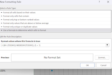
In this move, I am adding a formula that will show today's day in the calendar.

I have added some more forms to the conditional formatting to make excel mark completed tasks with a different colour, to show in dark blue what is the current percentage of the task and in light blue how much time we have given to complete the task. And this is the end of the Gantt Chart:

(Because of the scaling, this photo doesn't look very good. It looks much better on a computer screen.)

The whole creation process was made possible by David McLachla (2022), thanks to whom I learned to work in excel. A detailed tutorial on how to create a similar Gantt Chart can be found in the references.
References
McLachlan, D. (2022) How to Make the BEST Gantt Chart in Excel (looks like Microsoft Project!). 28 February. Available at: https://youtu.be/tuQpGzL_14g (Accessed: 30 November 2022)

This software example is really helpful for understanding practical applications of programming concepts. For students who struggle to implement these examples in their coursework, coding assignment helpcan provide additional guidance. Professional services not only assist in completing assignments but also explain the logic behind the code, helping students learn effectively. Using such support ensures accurate, well-structured solutions while improving programming skills and confidence in handling complex coding tasks.
ReplyDelete